Transfer Curve
How it clips. The transfer curve is the pedal’s clipping shape drawn directly: while a steady low note plays, the app plots the signal coming out against the signal going in, moment by moment.
What it shows
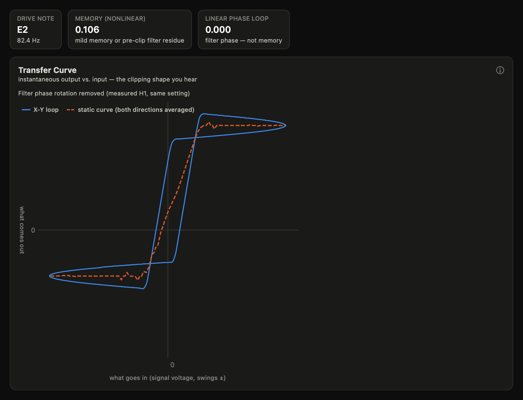
If you have ever looked at a compressor’s input/output display in a DAW, this is the same picture — input along one axis, output up the other, the device’s character in the bends — drawn for your pedal, from measurement. While a low note plays, this draws the output signal against the input signal. A device with no memory draws a single S-shaped curve — its clipping shape. An open loop means the output also depends on where the signal has been. But beware: plain tone filters (a hard clipper’s input high-pass and output low-pass) rotate phase and open the loop without any real memory. The compensation toggle divides out the pedal’s measured filter response: a phase-only correction fitted through the measured harmonic phases and applied across the full captured band, so it never changes how loud any frequency is — only when it arrives. That interpolation assumes the pedal’s filter phase varies smoothly with frequency, which is true of the resistor–capacitor networks pedals are built from. The caption under the toggle says where the measurement stops: the correction is measured only up to the highest harmonic that took part in the fit times the drive note (nine harmonics at E2 reach 742 Hz; a harmonic too quiet to vote lowers that), and above that support it is extrapolated — the fitted slope is extended and the last harmonic’s deviation is held. The loop number is split in two: the best-fit ellipse a linear filter’s phase would draw, and the nonlinear remainder — the memory figure the app quotes.
One caveat: the curve’s vertical position is arbitrary. It is reconstructed from the measured harmonics, which carry no DC term, so only its shape is meaningful — that’s why the output axis marks no zero. On a rectifier-like device the true curve may sit higher or lower than drawn; read bends and symmetry, not absolute output values.
Two kinds of “input” in PedalScope. This chart is the odd one out: its axes show the signal’s instantaneous value — the waveform’s voltage at each moment, which swings positive and negative as the string vibrates. Everywhere else (Compression, Gain Map, level sliders), “level” means the signal’s strength averaged over time (RMS, measured in dB), which is never negative — a quiet signal has a low level, not a negative one (the minus signs on those dB axes measure distance below digital full scale, not polarity). One waveform sweeping through this whole curve, corner to corner, corresponds to a single point on the Compression chart’s level axis.
What exactly is plotted
Each point of the trace is one instant of audio: its horizontal position is the input signal’s amplitude at that instant, its vertical position the output’s amplitude at the same instant (after the loop’s measured latency is removed, so the instants really correspond). Amplitudes are plain instantaneous signal values, swinging ± about zero, on a linear scale as fractions of digital full scale at the interface — not dB, not RMS. While the probe note plays, the point sweeps back and forth along the curve once per cycle; the chart you see is one full cycle of that motion, averaged over the whole capture (the first few cycles are skipped while the circuit settles) so noise averages out but the shape doesn’t.
The negative half is the bottom of the waveform. A sine swings symmetrically above and below zero, so the trace extends into negative input and negative output — the lower-left quadrant is the wave’s downswing. That’s what makes the symmetry reading possible: if the curve flattens at a different height in the upper-right than it dips in the lower-left, the circuit treats up-swings and down-swings differently, and that asymmetry between quadrants is precisely what puts even harmonics (the octave-flavored warmth) into the Harmonic Distortion chart.
Traveling around the loop is memory. If the trace were a pure function — every input value giving exactly one output value — the up-swing and down-swing would retrace the same line. When instead the trace encloses area, the output at a given input depends on where the signal has just been: the circuit is remembering — a shifting bias point, charge stored somewhere it shouldn’t be. Musically that’s the difference between a clipper that responds only to where your signal is and one that responds to where it’s been — the compressing, breathing quality of a bias-starved transistor fuzz under sustained input. Mind the compensation toggle before crediting a pedal with memory, though: ordinary tone filters rotate phase and open the loop without any memory at all (details below).
How to read it
The input axis is the signal swinging positive and negative. When the run’s calibration carries a scope-measured volts reference (see calibration), the ticks read real volts peak at the pedal’s input; without one they are the digital drive scale and the axis label says so — the app never invents a voltage it didn’t measure. A volts-calibrated axis also shades, on both swings, where typical passive single-coil and humbucker peaks live — broad orientation bands tagged with pickup glyphs, not norms (see comparing measurements).
The middle of the curve is your quiet playing: the closer to a straight line, the cleaner the pedal there.
The bends are where clipping starts. A gradual bend is soft clipping (a soft-knee overdrive); a sharp corner into a flat ceiling is hard clipping (a diodes-to-ground clipper at drive).
Top vs. bottom: if the curve flattens at a different height going up than going down, the clipping is asymmetric — that asymmetry is exactly what creates even harmonics (the octave-flavored warmth in the Harmonic Distortion).
The two loop numbers split the open loop into what a linear filter explains and what it can’t. Linear phase loop is the smooth ellipse a tone filter’s phase rotation draws — real, but not memory. Memory (nonlinear) is the area left after that best-fit ellipse is subtracted: the lobes and bands only bias shift or another true memory effect can draw. Near zero means a well-behaved memoryless clipper; a stubbornly high memory number is a bias-starved transistor fuzz misbehaving under sustained input. Area is counted lobe by lobe, ignoring the direction each lobe is traced: an earlier version summed them signed, so a figure-eight — two lobes wound in opposite directions — cancelled itself and could report a visibly open loop as 0.
Mid-range memory readings (roughly 0.05–0.15) are ambiguous — unless the removal applies. Tone filtering before the clipper rotates the drive itself, and every harmonic inherits a multiple of that rotation. When a paired Harmonic Distortion record exists, the removal handles this correctly: each harmonic is rotated against its own measured branch phase, which carries filtering before and after the clipper by construction. Without a usable pairing the hedge stands: a pedal with a strong input filter can sit here while having no memory at all, and the app’s wording hedges accordingly.
Polarity is stated when it’s proven. A Polarity tile reads inverting or non-inverting once this capture’s pairing with the Harmonic Distortion record is confirmed — the same alignment fit the phase removal uses, so there is no second detector to disagree with it. Polarity changes nothing on its own and everything in combination: blended in parallel with a dry path (bass drive blends, DAW parallel chains), an inverting pedal partially cancels instead of reinforcing. No confident determination → no tile — absence is honest, a guessed sign is not. The fact rides exported PNGs’ annotation strip — for the record the chart shows, which under a drive-note pick can be a sibling record — and Compare flags the one consequence when two devices disagree.
Up/down orientation is resolved, not assumed. A plugin-measured capture aligns itself to the probe tone, and that alignment is blind to polarity — the trace upside-down fits exactly as well. So the displayed orientation comes from the measured H1 of the paired Harmonic Distortion record (a non-inverting pedal draws ascending), and the chart says so under the toggle when that resolution was applied. Without a confident pairing the curve displays as captured and the app implies nothing about polarity. Hardware captures align against the full measurement chain instead of the tone and are immune.
The removal is measured, guarded, and says why when it declines. The correction aligns this capture against the paired Harmonic Distortion record’s measured per-harmonic phases: a genuine pairing fits a single time shift across every usable harmonic (the two records each measure their own latency, so a shift between their frames is legitimate and is never applied as rotation), and the leftover misalignment — the residual quoted under the toggle — is the removal’s quality stamp. The correction itself is applied as a smooth phase adjustment across the full captured band — it passes exactly through the measured correction at each usable harmonic and interpolates between and beyond them, so everything the capture contained stays in the picture. “Beyond” is extrapolation, and the caption states its edge: the support is the highest harmonic that voted times the drive note, quoted in hertz beside the count of harmonics that voted against the count measured; above it the fitted slope is extended and the last harmonic’s deviation is held — a hard-clipped device has energy far above that edge, and the picture there is the estimate, not the measurement. (An earlier version rebuilt the curve from the usable harmonics alone, which drew faint truncation ripple on hard-clipping plateaus — wobble the pedal never made.) Three other outcomes get three honest messages. No shift fits: the pairing itself is wrong (a different session, setting drift, a contaminated capture) — the app declines, names the record it judged, and prescribes the fix: re-measure Harmonic Distortion and Transfer Curve at this setting in one session. The loop is already closed: nothing to remove, and a neutral note says so — no warning, because nothing is wrong. Too little harmonic content to verify the pairing: the removal stays off rather than guessing (a frame fitted through one point proves nothing). Exported PNGs state whichever of these applied as a caption in the image, so a shared picture can’t be mistaken for another view.
What’s musically meaningful
The curve is the pedal’s touch translated to a picture. Soft knees respond to pick strength gradually — dynamics survive, compressed. Hard ceilings turn everything past a threshold into the same output — sustain, at the cost of dynamics. Asymmetry adds even-order color. None of this is good or bad; it’s what you’re choosing between when you choose or design a drive pedal.
The waveform pane
Below the curve, the Waveforms pane shows the same story the way an oscilloscope would: a few cycles of a steady sine before the pedal (dashed) and after it (solid), at the record’s own drive note — with a picker for common reference notes. A flattened top, a clipped ceiling, or a lopsided wave is the transfer curve’s bend seen in time.
At the record’s own drive note, the wave you see is the measurement itself — the phase-averaged cycle this very capture stored, tiled a few periods, with nothing rendered or reconstructed. The caption says “measured”. It is drawn with the same up/down orientation the curve above resolved: when the curve’s orientation came from the paired Harmonic Distortion record’s H1 (the “displayed with true polarity” case above), the wave carries that resolution too and says so in its own caption — the Polarity tile, the curve’s slope and the wave never disagree about which way is up. A measured cycle is the gold standard here: the model render has known ways to be wrong, and the capture has none. At the other picker notes no measured cycle exists, so those waves are rendered offline from the record’s fitted model, never captured live, and only within the level the model was fitted at — the caption states the source record and the input level (in real volts when the rig’s calibration measured the factor, and as digital full scale on a plugin record, where no voltage exists without a declared reference). Input and output share one amplitude axis, so relative level is honest; like every model-rendered surface, a single-level model wears its “coarse” label.
The pane renders at the transfer curve’s own capture drive, and the caption says so. That matters because distortion is drive-dependent: the fitted model can usually render far louder than the sweep that drew the curve, and a wave rendered up there is a different operating range of the same device — the two panes would be telling two truths side by side while the linked marker implied one traversal. When the fitted model cannot reach the capture drive, the caption names both drives and withdraws the one-operating-point claim instead of quietly showing the mismatch.
At the model-rendered notes, sometimes the pane draws no wave at all and says why: the fitted model is bounded in shape as well as in level. (The record’s own drive note never refuses — its wave is the measurement, which needs no model.) When the measured harmonic content at the chosen note and drive is less than about 1% of the wave — the same 1% this app calls “clean” elsewhere — the true wave is indistinguishable from a pure sine at this scale, and anything a model render would show (a flat top, a kink at the crossing) would be the rendering machinery’s own artifacts rather than the pedal. The pane states the refusal with the measured depth instead of drawing a confident wrong picture; picking a higher note often helps, because many devices’ content grows with frequency.
There is a second reason the pane refuses, and it is about the renderer rather than the pedal. A Gain Map model is a stack of fits, one per measured drive level; to render at a level between two of them the app blends the two neighbouring fits, and the quieter of the two is handed a signal louder than it was ever measured at. What comes back is hard-limited, which adds a flat-topped clipping artifact the pedal does not have. It is small next to a real distortion — on a fuzz you would never hear or see it — but it does not shrink as the pedal gets cleaner, so on a mild pedal, a clean setting, or the quiet end of a decay it can be most of what a rendered wave shows. The pane compares the two: when the blend would invent more harmonic content than the measurement resolves, it refuses and says so in those words. Rendering at one of the measured drive levels, or at a note and drive where the pedal distorts harder, draws honestly.
The drawn wave is always centred on zero, and that is a measurement fact rather than a drawing convention: the sweep reads harmonics starting at the fundamental, so the app never measures a DC offset, and the signal path it measures through is AC-coupled at both ends anyway — a pedal’s own output capacitor, then the interface input. A real full-wave rectifier sitting on a bench does hold its output well above ground; what reaches this app, and therefore what the model can speak for, is that wave with its offset already removed. Any pedestal in a rendered wave would be the renderer’s own, so the render blocks it.
A clipped wave that still looks round is usually not a rendering fault. The drawn output is reconstructed from the harmonics the sweep measured, so it is band-limited — the sharp corners of a square-ish wave live in harmonics far above the measured band — and the pedal’s own tone stack rolls off the upper harmonics before they reach the output anyway. Hard clipping inside the circuit plus band-limit and tone rolloff outside it is exactly a rounded wave with mild ripple; read the flattening, not the corners.
While a Hear-it lane plays, a marker sweeps the waveforms and a linked dot traces the corresponding operating point along the transfer curve — slowed far below the audible rate so the eye can follow — and during the drive ramp the drawn wave follows the momentary level, visibly bending into the clipped shape as the ramp climbs. The animated wave is drawn at true scale against the pane’s fixed axis, and a chip states its momentary input level — a small wave during a quiet passage is the level being genuinely low, not a rendering fault.
Hear it
The view’s Hear-it panels play the curve. Drive ramp pushes a low note from whisper to full over six seconds through the pedal’s measured model while the playback loudness is held constant: the input climbs the curve — a marker climbs with it, mapped so the top lands on the loudest measured excursion — but each moment of the ramp is matched to the same loudness, so what changes is purely the texture as the waveform reaches further into the bends. (Loudness-versus-drive is the Compression view’s story; this panel deliberately removes it so the curve’s own story — timbre at fixed loudness — is what you hear.) Symmetry morph holds a note at the measured knee and lets you strip the even harmonics away: while it plays, a marker holds still at that operating point on the curve, and the asymmetric warmth disappearing is the top-versus-bottom difference of this very curve, audible. Added content isolates everything the circuit did that a linear system could not — the output minus its best linear explanation — and amplifies it for listening. That lane is diagnostic, NOT what the pedal sounds like: its true level relative to the output and the applied gain are stated in the panel, and a very quiet residual is itself a finding (a clean device adds almost nothing). Every comparison lane pair is loudness-matched, so neither side wins by being louder. Use headphones or full-range monitors — laptop speakers hide what these comparisons teach (see Listening conditions on this page).
All three panels follow the Waveforms pane’s note picker: pick a different probe note and playback re-renders at it (a moment of “rendering” is normal — everything stays offline), so what you see in the waveform pane and what you hear are always the same note. Each panel states its note in the footer.
Every panel with a comparison toggle also states its measured contrast for this record’s model in the footer — the same spectral metric the release listening battery asserts. A small number (the footer says when it falls below the battery’s contrast floor — a bar on the measured metric, not a hearing threshold) means the toggle is subtle on this device — a symmetric pedal’s even-harmonic removal is the classic case — and that subtlety is itself the finding, not a playback problem. And when the record’s measured compression knee sits at or below the ramp’s quietest point, the Drive-ramp panel says so: the whole ramp then lives above the knee, so its travel changes texture rather than journeying from clean to dirty.
And when the lanes are rendered from a Gain Map model, the footer states the boundary the waveform pane refuses at, because the lanes carry it even where the pane would not draw it. Blending between two measured drive levels adds a small clipping artifact of its own (the pane’s second refusal, above), and that artifact does not fade as the note does — so below a stated distance under the loudest measured drive, the grit in a decaying tail is the renderer rather than the pedal, and these lanes clean up less than the pedal really does. On a strongly distorting pedal it sits far under the real distortion and the footer stays quiet; on a near-linear one it is the whole story, and the footer says that too.
Listening conditions
Hear-it comparisons are only as honest as the playback chain — and the ears at the end of it, whose own behavior depends on level. Three things to know, one habit to keep:
Your hearing changes with volume. The ear’s frequency balance is level-dependent (the classic equal-loudness contours): the same audio played louder reads as warmer, fuller, and more detailed — see why louder sounds better. So absolute character impressions (“this pedal is bright”) shift with your playback volume, and PedalScope cannot correct for that: it has no measurement microphone, does not know the sound pressure level at your ears, and makes no claim to calibrate perception.
Comparisons survive; impressions drift. What the app does promise is that every A/B it plays is loudness-matched, so comparative judgments — which lane is brighter, where the grit arrives, what the even harmonics were adding — are valid at any comfortable playback level. The habit that keeps them valid: pick a level and keep it constant within a listening session. Conclusions formed at different volumes aren’t about the same thing.
Poor conditions genuinely shrink the differences. Listen on headphones or decent full-range monitors at a moderate level when you can. Built-in laptop speakers do two things that work directly against these demos: they band-limit (almost nothing comes out below ~150 Hz, so a low E’s fundamental — and the deep difference tones the intermodulation demos isolate — simply never reaches your ears), and at high volume they compress, flattening exactly the level and dynamics differences the panels are teaching. At very low volume, the equal-loudness effect above thins the lows and highs out of everything. None of that is the demo failing — it’s the difference being erased on the way to you, and a comparison judged under conditions that erase it says more about the conditions than the pedals. Every Hear-it page in this guide assumes a reasonably full-range, uncompressed playback path.
Listen for: The note holds one loudness throughout; what changes is its texture — nearly pure at the start, growing hair from the middle onward as the waveform pushes into the curve's bends. That arrival of grit at constant loudness, not a volume change, is what the ramp teaches.
Common misreadings
An open loop doesn’t automatically mean “memory”. Ordinary filters open the loop by shifting phase. On the project’s reference hard clipper, 0.52 of a 0.56 total loop was the linear ellipse — nearly all of that loop was just the tone filters. Judge memory by the Memory (nonlinear) number with compensation on (it uses the measured harmonic phases from the pedal’s own Harmonic Distortion measurement at the same knob settings — a different setting is a different filter, so the app never borrows another setting’s phases; measure Harmonic Distortion at the setting you’re judging).
One curve is one level. The shape can change dramatically with drive level — a curve measured at −40 dBFS says little about behavior at −12 dBFS. Match levels before comparing devices.
The probe is a low note on purpose (default E2, 82 Hz): low frequencies minimize filter phase rotation so the clipper itself is what you see.
Choosing the drive note and level
The measure sheet’s Transfer Curve options select the stimulus:
Drive note. The dropdown runs from the E2 standard up to C7 (2093 Hz). Low notes show the clipper cleanly; high notes near a tone filter’s corner make the phase-removal check earn its keep — at E2 a typical filter rotates so little that compensation looks perfect whether or not it works, while a note at the corner draws a fat ellipse that must collapse when compensation is on. The note is part of the record: the chart’s Drive note tile always names it.
Drive level. The standard −26 dBFS matches the fingerprint sweep, so curves correspond across measurement kinds. Louder drives reach the shapes a standard-level curve never touches — a diode clipper whose knee sits above the standard drive draws a straight line until the level actually reaches conduction. One curve is one level (see above); the level is recoverable from the record’s stored input cycle. PSC-1’s badge anchors the Harmonic Distortion sweep drive only — a non-standard level here is a legitimate stimulus choice, not a provenance defect.
Note range. The range capture measures E2, A3, and A4 in one run, saving one record per note — useful when a memory mechanism lives at a frequency corner: watching the loop area shrink (or not) as the note climbs past the corner separates a real corner from a level effect.
When a setting has Transfer Curve records at more than one drive note, the record page grows a Drive note picker. The pick persists across records and app launches, so you can follow one note from pedal to pedal; when it redirects to a sibling record, a caption names that record and its measurement date, and the caption rides along in chart exports.
Try it on a record: open a Transfer Curve measurement.