Gain Map
How the dirt changes as you play harder. One Harmonic Distortion measurement is one input level — one slice of a pedal that lives on a whole range of them. The gain map repeats the harmonic sweep at stepped input levels (eight by default, quiet to hot) and stacks the results into a map of the pedal’s entire dynamic life.
What “drive” means on this chart: the level of the input signal driving the circuit — which the app sweeps electronically, exactly as your pick strength and your guitar’s volume knob would. The pedal’s own drive knob is never touched while the map is measured; the knobs stay wherever you set them, and that setting is recorded with the measurement. To map what the knob does, measure it as a set of variants — one gain map (or Harmonic Distortion run) per knob position.
What it shows
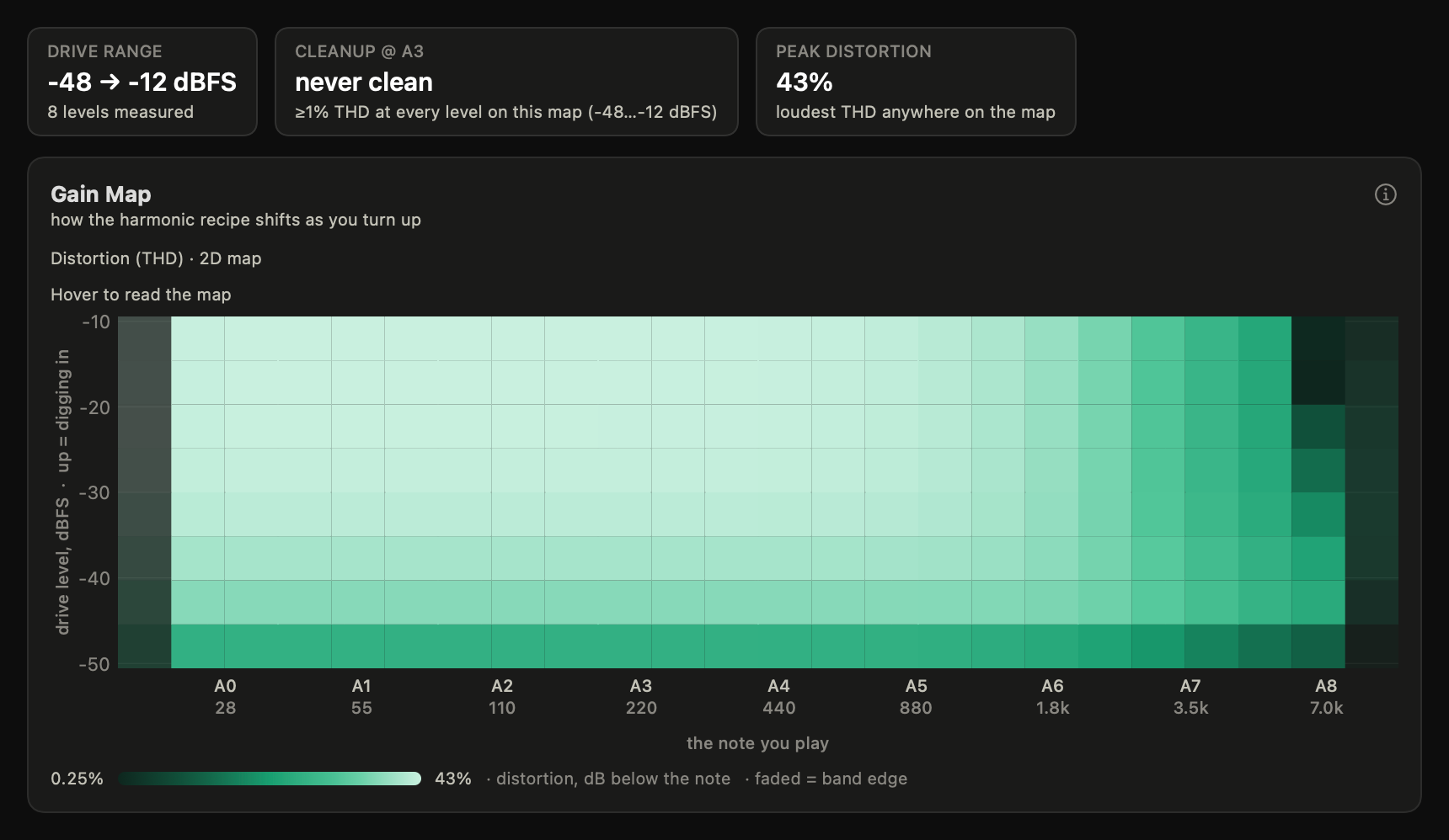
Every row of the map is one input level (bottom = playing soft or rolling your volume down, top = digging in hard); left to right is the note you play. Brightness is how loud the chosen ingredient is — total distortion, or one harmonic at a time. A pedal that “cleans up” goes dark along the bottom rows; a fuzz stays bright everywhere. “Drive” here is always the signal level driving the circuit — the app never turns the pedal’s knob. Pick single harmonics to watch the recipe change: many circuits trade even warmth for odd grit as the input level rises.
The same data also renders as a rotatable 3D surface — frequency × level × loudness. Same numbers, different grip on them; the 2D map is the reference reading. Drag the surface to rotate it; the pose holds while the view is open. Copy/Save export the 2D map even when the surface is on screen — the 3D view can’t render to an image, and the export’s caption says so.
The map’s color ramp is a preference (Settings → Visualization): Aqua (the default), Viridis, Magma, or Graphite. One selection drives the 2D map, the 3D surface, and the legend together, and chart exports carry it — the figures in this guide always use the default. All four ramps keep brightness proportional to magnitude; Viridis is robust across color-vision types and Graphite survives grayscale printing.
The note axis follows the app-wide Range selector (Full / Audio / Guitar) and, on the 2D map, the Hz-vs-note Unit selector — see Harmonic Distortion. The 3D surface keeps its octaves-above-20 Hz labeling (its ticks are the framework’s own), with the caption as decoder ring.
How to read it
Scan bottom to top at your favorite note: that vertical line is what your volume knob and pick strength traverse. A tall dark-to-bright gradient is a touch-sensitive pedal; bright everywhere is a fuzz that’s always itself. On a volts-calibrated rig, two lightly shaded rows mark where typical passive single-coil and humbucker outputs land on the drive axis — broad, tagged with one- and two-coil pickup glyphs, and drawn only when the volts factor was actually measured (see comparing measurements).
The cleanup contour — where the map crosses ~1 % THD — is the border the app draws between “effectively clean” and “driven”: a convention for reading the map, not a hearing threshold. Its height tells you how much rolling off actually helps. The Cleanup @ A3 tile reads that contour at A3: a genuine crossing quotes the drive level; a column that never reaches 1 % reads “always clean”, and one that never drops under it reads “never clean” — neither direction dresses an endpoint of the measured drive range up as a crossing. “Never clean” is a claim about this map’s drive range (its floor is −48 dBFS by default), not about the pedal: the Compression probe reaches −70 dBFS, so a pedal can clean up below everything the map measured. When this pedal’s own Compression record finds such a crossing, the tile says so — “cleans up below this map’s range — see Compression”.
Switch the displayed ingredient. Total THD answers “how dirty”; individual harmonics answer “dirty how”. Watching H2 versus H3 across level shows whether warmth survives at full drive or gives way to grit.
Tilt across frequency is character. The project’s reference hard clipper shows a slew-limit signature here: at high drive, distortion rises toward the treble — a diagonal tilt in the map that reads as that aggressive, torn top end. A tone-filtered soft clipper tilts the other way, darker as you go up.
The treble edge counts fewer harmonics — that’s physics, not the pedal cleaning up. THD cells integrate the audible band (20 Hz–20 kHz), and near the top of the map most of a note’s harmonics sit above it, so the rightmost columns naturally read lower. When you view a single harmonic, columns past that harmonic’s reliable measurement edge draw faded — those cells are analysis artifacts, and hover says so.
Both band edges are guarded. The leftmost column sits at the sweep’s own start frequency, inside its fade-in ramp, and the rightmost column sits at its end frequency, inside the fade-out ramp — a jumpered wire shows the same deterministic readings in both, so they are properties of the measurement, not the pedal. Both draw faded, hover says “inside the sweep’s fade-in edge” / “fade-out edge”, and neither ever touches the color scale or the tiles. The legend’s endpoints are the map’s own dimmest and brightest unmasked cells — the scale never quotes a value no honest cell reaches. At the other extreme, quiet high-note cells can read the interface’s own noise floor rather than the pedal: on calibrated records those cells dim in proportion to how little they stand above the rig floor, and hover marks them “at the rig floor”. On a plugin record the floor is the plugin’s own declared noise floor, not the render path’s numerical silence — the render path hears nothing, so measuring against it would credit every cell with clearance it does not have.
The Peak distortion tile only quotes cells that stand clear of the rig floor, and only a peak with a shoulder. On a clean device nothing does, and the tile becomes an honest bound — “≤ 0.1%”: the map can only say the pedal distorts at or below what the rig itself reads. A genuine clipper’s peak is untouched by the guard. Three things keep a clean device from reading a number here. The floor a cell is judged against includes what the analysis itself reads with nothing in the loop — one column above the sweep’s start the fade-in ramp leaks into the second-harmonic read at every level, on a 5 s sweep about 0.03 %, and a noise floor cannot see a leak that scales with the signal. The floor is never extrapolated louder than the calibration’s own sweep: at the loudest drives the interface’s own linearity was never measured, so the last measured floor stands. And a cell is quoted as the peak only when the cell one note-column beside it also stands clear — a nonlinearity acts on the neighbouring notes too, while a noise read that happens to be the loudest of 176 has no such shoulder. A passive divider measured on two days read 0.69 % and 0.03 % from two different corner cells before these rules and “≤ 1 %” after them; a clipper’s 11.2 % did not move.
What’s musically meaningful
This is the chart for “does it clean up?”, asked precisely. It also separates two pedals that measure alike at noon: one may hold its harmonic recipe steady across levels (predictable, mix-friendly) while another reshapes itself every 6 dB (alive, or unruly — your call). When you’re choosing where to set a drive knob, you’re choosing a row of this map.
Hear it
Two Hear-it panels play the level axis. Decay cleanup sends one long plucked low E through the model: as the note dies away it slides down the map’s rows, and the distortion melts off in real time — a marker descends the level axis with it. Touch dynamics plays the same string picked soft, medium, and hard; the whole phrase is loudness-matched once, not per note, because the ratio of dirt between your soft and hard picking is exactly the thing to hear. Gain maps measured before this release play through a single-level model and wear a “coarse” badge — remeasure to get level-interpolated renders. The footer states the toggle’s measured contrast for this record’s model — a number below the stated contrast floor (a bar on that measured metric, not a hearing threshold) means the comparison is subtle on this device, not a playback fault. On a strongly compressing device the decaying tail can develop a slow pulse — a swell in and out, once or twice a second. That is the synthetic string’s own gentle beating (it sounds two very slightly detuned polarizations, as a real string does) being amplified by a device whose gain follows the input envelope. When it is deep enough to hear, a caption quotes the swing measured on both lanes, so you can check the Bypass lane and hear the same beating in its quiet original form. It is the device acting on the string, not a rendering fault. Headphones or full-range monitors recommended — see Listening conditions.
Listen for: The attack is fully distorted; as the note fades, the fizz thins out well before the note itself disappears — the pedal is sliding down the dark rows of its own map.
▶ See a frequency-tilted gain map: raise the slew limit in Simulation mode
Common misreadings
The level axis is interface drive, not your drive knob. The map varies how hard the signal hits the pedal — the electronic equivalent of pick strength and guitar volume — with the knobs untouched. To map the knob itself, measure a variant per knob position (family runs automate the switch version).
Rows are separate measurements. The pedal isn’t being ridden in real time; each level is its own sweep, measured seconds apart. Circuits that drift or sag between notes can show row-to-row wobble that isn’t “the drive knob doing something”.
Dark isn’t silent. Dark cells mean low added distortion, not low output — the pedal may be loud and clean there. Loudness lives in the Compression chart.
Try it on a record: open a Gain Map.