Compression
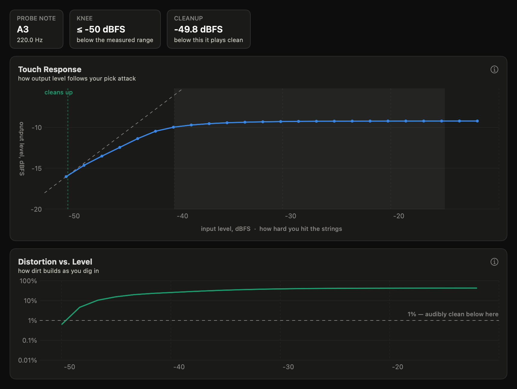
Touch response. This measurement steps a single note from whisper to roar and records what comes back at each step. The result is the curve your picking hand already knows: where playing harder stops getting louder.
What it shows
The dashed line is a pedal that doesn’t compress: 1 dB in, 1 dB out. Where the measured curve flattens away from it, playing harder stops getting louder — that’s the squash you feel under your fingers. The knee marks where that starts; the cleanup point is the input level below which distortion falls under 1% (roll your guitar volume down to get there). The shaded band is roughly where guitar pick attacks land at sane interface gain — it shifts with your gain knob. When the record’s calibration carries the measured volts factor, that approximate band is replaced by two in real volts — where typical passive single-coil and humbucker outputs live, each tagged with a small pickup glyph (one coil row = single-coil, two = humbucker; broad by design — see comparing measurements).
Levels here are time-averaged (RMS, in dB) — not the instantaneous ± voltages of the Transfer Curve.
How to read it
The knee is where the squash begins. A knee below the guitar band means the pedal is always compressing your playing; a knee above it means you only touch the ceiling on hard attacks. The value is fitted — two line segments through the whole measured curve, with the breakpoint free to land between probe levels — and its displayed precision follows what the fit actually resolves (tenths of a dB for a crisp knee, whole dB for a smeared one).
“Knee ≤ …” is a bound, not a reading. A pedal already compressing at the quietest level the measurement probes has its true knee below the measured range — no number in range can locate it, so the app reports the honest upper bound (“knee ≤ −70 dBFS, below the measured range”) at low confidence instead of dressing the lowest probe level up as a point estimate. Summaries phrase these knees “at or below”. The probe now reaches −70 dBFS by default (deep enough that most knees — including high-gain fuzzes that used to bound at the old −50 dBFS floor — resolve to numbers), so a bound today means seriously compressed.
The quiet end is guarded against hiss. Probe steps that come back within 6 dB of the loop’s own noise floor (measured from the silent lead-in, pedal hiss included) are excluded rather than plotted — a drowned step’s “output level” would be the hiss, not the note, and it would fake a knee. When steps are excluded the curve simply starts at the quietest honest level, and any bound reads from there.
A fine-step window sharpens one region. The standard ladder spaces its steps about 1.7 dB apart — coarse enough that a feature spanning a single step is ambiguous: a genuinely straight dead region (a table-style transfer) and a very steep soft onset look the same when the whole transition falls between two rungs. The measure sheet’s Fine window option adds extra steps at 0.5 dB spacing over a span you choose (capped, so a wide window widens its own spacing instead of ballooning the run). Same tone, same noise guard — just a denser ladder where the question lives.
The slope after the knee is the character of the limit. A slope near 1 is clean bleed-through — pick attack survives (a soft-knee overdrive). A slope near 0 is a true limiter: everything past the knee comes out the same. The project’s reference hard clipper measured a slope of 0.00 over its top 15 dB — a brick wall, which is exactly the “endless sustain, flattened dynamics” feel of a hard limiter.
The cleanup point is the roll-your-volume-down number: below it, THD drops under 1 % and the pedal is effectively clean. The crossing can be missing in either direction, and both read as behaviors rather than levels: a fuzz that “never cleans up” stays over 1 % at every measured level, and a transparent device — a buffer, a clean boost — reads “always clean” because it never distorts in the measured range. Only a genuine crossing quotes a dBFS number (and draws the dashed “cleans up” marker on the curve); the edge of the probe range is never dressed up as a property of the device.
The input axis states its physical quantity. dBFS is not one thing: a hardware record’s input axis is the interface’s output level, while a plugin record’s is digital full scale — its axis says so (“dBFS (digital full scale)”), and the two lattices are not comparable numbers. If a hardware run’s calibration carries the scope-measured volts reference (see calibration), the input axis and the knee/cleanup tiles read in real volts peak at the pedal’s input — “12 mV pk” — with the interface dBFS kept in the tile subtitle; a bound knee keeps its “≤” in volts too. Volts are the guitar-signal truth of the same measurement, and they are what transfers between rigs.
The companion THD curve
Total harmonic distortion at the probe note as drive increases. A pedal that “cleans up” drops below 1% at low levels; a fuzz that is never clean stays high across the whole range. The dashed 1% THD reference line is a quantity, not a verdict on hearing: how a given percentage lands on a listener depends on the harmonic recipe, the playing context and masking, and no single figure stands in for that (this app prints no hearing threshold). Treat the line as a consistent landmark for comparing curves, nothing more.
Two different quantities can hide in one trace: THD (the device’s own added harmonics) and THD+N (harmonics plus the rig’s noise). The noise is a fixed absolute level while the note shrinks with drive, so toward the quiet end noise makes up an ever-larger share of the reading — the classic low-level upturn is usually the rig, not the device. When the measurement carries its own noise stamp (taken from the silent lead-in, pedal hiss included), the chart says which is which: a fine dashed line is that noise floor expressed against the note (a worst-case bound), the shaded band above it is the noise-dominated region, and inside the band the trace turns dotted — there it reads THD+N, and the faintest dots sit at or below the floor, where the honest claim is only “distortion ≤ the floor”. Segments below the chart’s own 0.01% axis minimum are drawn as a gap, never as a line at the axis edge — a flat run at the chart floor would look like a measurement, and the true values there are simply lower than the axis can draw. Records measured before the noise stamp existed draw without the overlay.
The chart always names which floor you are looking at, because there are two and they are not the same measurement. By default it is this capture’s own noise stamp — the broadband hiss bound above, pedal included. But if the library holds a null run — the loop measured with nothing in it — captured under this record’s exact calibration, the chart prefers that instead: a measured floor beats an inferred one, because it contains the rig’s real distortion and not just an upper bound on its noise. The line is then labelled “floor: null run” with the control capture’s time. Two details keep it honest: the null run’s contribution is absolute, so it is scaled to this record’s own note level (a pedal with gain sits further above the same floor; one that pads sits closer to it), and it is never allowed to fall below this capture’s own noise stamp — the bare loop never heard your pedal’s hiss. A null run from a different calibration is never used: that measured a different rig state, and a borrowed floor is worse than an honest bound.
Read the two together: the level curve says what your volume does, the THD curve says what your tone does at the same moment. Touch-sensitive pedals show a wide region where both are in motion.
What’s musically meaningful
Compression here isn’t a compressor pedal’s pumping — it’s the feel dimension of drive. Where the knee sits relative to your pick attack decides whether dynamics live or die; the slope decides whether digging in adds edge or just adds sameness; the cleanup point decides whether the guitar’s volume knob is a second channel or just a mute.
Hear it
Knee walk plays a run of plucks stepping in level uniformly across the whole measured range, through the pedal’s model and through a clean bypass. Below the knee the two lanes track each other; past it the pedal’s plucks stop getting louder and start getting thicker — limiting, as a feeling instead of a slope readout. While it plays, a pulsing marker sits on the touch-response curve at each pluck’s attack level — the level the curve is measured from — so you can watch the plucks step across the knee as you hear them. Each marker holds its position and fades out at the note’s own decay rate; the next pluck moves it to its new spot on the curve. The comparison is loudness-matched as a whole, so the flattening you hear is the curve, not a volume trick. One scope note: this illustration depicts the loudness-versus-drive story only. Asymmetry — the top of the waveform treated differently from the bottom — is a waveform-shape property whose audible signature is even-harmonic timbre; to hear it, use the even-harmonics comparisons on the Harmonic Distortion and Transfer Curve views. The footer states the toggle’s measured contrast for this record’s model — a number below the stated contrast floor (a bar on that measured metric, not a hearing threshold) means the comparison is subtle on this device, not a playback fault. On a high-gain record the loud end of the walk sounds heavily distorted, and that is the point: the walk is built to cross the knee, so its top rungs are plucked above it. A caption says how many of the steps sit there, because a steady stream of plucks through hard clipping is the harshest thing this app will ever play you, and it should read as the measured model saturating rather than as something broken. Headphones or full-range monitors recommended — see Listening conditions.
▶ Move a knee yourself: swap Si for LED diodes in Simulation mode
Common misreadings
The guitar band is approximate. It marks where pick attacks land at sane interface gain staging — your interface gain knob moves your playing within (or out of) it. Comparisons between pedals at the same rig are fair; absolute claims need the level calibration taken with salt. On a volts-calibrated rig the chart swaps in the typical single-coil / humbucker bands instead — rig-independent, but still typical, never a norm: pickup output varies a lot with model, height, and playing force.
The probe is one note (default 220 Hz). Circuits with strong tone filters compress differently across the neck; run the probe at another pitch before generalizing.
Distortion rising as you get quieter is most often the rig’s noise floor, not the device: the noise is constant while the note shrinks, so the ratio climbs — the THD+N bathtub. The chart now shades that region and dots the trace inside it (see the THD curve section); an upturn outside the shaded band is real behavior for some circuits (crossover distortion in certain amps). For pedals, suspect gating or a dying battery before exotic circuit stories.
Try it on a record: open a Compression measurement. To judge two devices’ touch response against each other, compare two Compression records on shared axes — solo pages autoscale per record, which flatters flat curves.